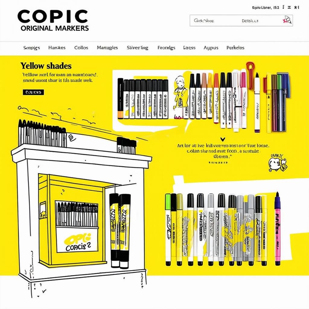
Маркеры Copic Original: желтые оттенки
Introduction: The Strategic Role of Yellow in the Copic Original System
The Copic Original marker system, renowned for its professional-grade alcohol ink and refillable design, organizes its palette into logical color families. The yellow spectrum, encompassing the pure Yellows (Y), Yellow-Reds (YR), Yellow-Greens (YG), and the Earth tones (E), forms a critical foundation for any artist's toolkit. Unlike casual or decorative use, professional illustration, product design, and comic art demand a nuanced understanding of these subsets. This analysis moves beyond a simple swatch list to deconstruct the functional characteristics, mixing behaviors, and ideal applications of each yellow family, providing a framework for informed selection based on project requirements rather than arbitrary preference.
Choosing the correct yellow variant is not merely about hue; it involves considerations of opacity, blending synergy, and role within a color hierarchy. A marker from the YR series behaves fundamentally differently in skin tone rendering than a YG does in botanical illustration. Furthermore, the investment in Copic markers necessitates a strategic approach to building a palette that avoids redundancy and maximizes mixing potential. This report dissects these four approaches to 'yellow' within the Copic ecosystem, offering a comparative lens for both novice and experienced practitioners.
The analysis is grounded in the physical properties of Copic Original inks: their high blendability, low odor, and consistent dye-based formulation. We will evaluate each color family against key parameters such as vibrancy, naturalism, versatility in gradients, and compatibility with other Copic families like Reds (R) and Blues (B). The final goal is to equip the user with a decision-making matrix that translates technical attributes into practical artistic outcomes.
Family 1: Pure Yellows (Y Series) – The Foundation of Light and Luminosity
The Y series represents the most optically bright and saturated yellows in the Copic range. Colors like Y00 (Barium Yellow), Y02 (Canary Yellow), Y08 (Acid Yellow), and Y38 (Honey) are engineered for maximum light reflection and purity. These markers are indispensable for creating primary mixes, generating highlights, and depicting artificial or intensely lit elements. Their high chroma makes them less suitable for direct, unmodified application in realistic shadows or naturalistic scenes, where they can appear artificially bright.
The primary strength of the Y family lies in its mixing power. A light Y00 is a quintessential base for lightening other colors without causing dramatic hue shifts, while a saturated Y08 can create vibrant oranges and limes when layered with R and G families, respectively. However, their low opacity means they can be easily overwhelmed by darker, more saturated colors, requiring careful layering order. They are also the most prone to showing paper texture if applied with a heavy hand, as the light value offers little coverage for underlying imperfections.
- Pros: Unmatched brightness and luminosity; essential for clean secondary color mixing; ideal for light sources, sunlit areas, and synthetic materials; excellent as a first layer for gradient creation.
- Cons: Can appear chalky or unnatural if used alone for shadows; low covering power; requires precise blending technique to avoid streaking in large areas; limited use in muted or realistic palettes without modification.
Recommendation: The Y family is non-negotiable for any starter or professional kit. Prioritize Y00 for a versatile light blender and highlight base, and Y08 for a potent, saturated mixing yellow. They are best suited for illustrators, concept artists, and designers working with pop art, children's books, or any project demanding high-energy color.
Family 2: Yellow-Reds (YR Series) – The Workhorse of Warmth and Organic Tone
The YR series seamlessly bridges the yellow and red spectrums, producing the oranges, ambers, and ochres that are ubiquitous in the natural and man-made world. This family, including YR02 (Light Orange), YR07 (Cadmium Orange), YR14 (Caramel), and YR24 (Pale Sepia), is arguably the most versatile of the yellow variants. Its inherent warmth makes it the cornerstone for depicting skin tones (especially in Caucasian, Mediterranean, and Latin American complexions), wood, leather, autumn foliage, and warm lighting conditions like sunset or incandescent light.
From a technical perspective, YR markers possess excellent blending characteristics within their own range and with adjacent R and Y families. They offer greater depth and coverage than pure Yellows, allowing for more convincing shadow development. A marker like YR14 can serve as a base for countless organic materials, while YR07 provides a vibrant, clean orange for graphic work. The limitation of the YR family is its specificity; its warmth can contaminate mixes intended to be cool or neutral, requiring careful palette management.
- Pros: Unparalleled versatility for realistic and organic subjects; essential for a vast range of skin tones; creates natural, easy-to-control shadows and gradients; excellent for rendering textures like wood and rust.
- Cons: Can introduce unwanted warmth if used carelessly in cool palettes; the most extensive family, which can lead to over-purchasing similar shades; vibrant oranges (YR07) may lack subtlety for highly realistic illustration.
Recommendation: The YR family is the highest-priority investment for character artists, portraitists, and anyone focused on realism. A core trio of YR02 (light), YR14 (mid-tone), and YR24 (shadow) forms a complete blending group for countless applications. It is less critical for those working exclusively in cool or futuristic color schemes.
Family 3: Yellow-Greens (YG Series) – The Essence of Nature and Cool Undertones
The YG series introduces a green bias to yellow, creating the spectrum of chartreuse, limes, and leafy greens. Colors such as YG01 (Green Bice), YG03 (Yellow Green), YG17 (Grass Green), and YG67 (Moss) are specialized tools for botanical illustration, landscape, sci-fi environments, and creating cool, acidic highlights. This family is crucial for achieving believable foliage, where pure yellow is too warm and pure green is too cool.
These markers excel in creating naturalistic greens when layered over Y series bases or mixed with BGs (Blue-Greens). YG03 is a quintessential mixing tool for vibrant vegetation, while YG67 provides a deep, muted shadow green for forests and dense foliage. The challenge with the YG family is its narrow application scope outside of natural greens and specific atmospheric effects. Used incorrectly, it can make subjects look sickly or unnatural, particularly in skin or fabric rendering.
- Pros: Absolutely essential for any form of botanical or landscape art; creates the most realistic and varied plant greens; useful for creating toxic, alien, or unnatural lighting effects; excellent for shading white objects under green foliage.
- Cons: Highly specialized application; can be difficult to control in mixes without creating 'muddy' colors; less versatile than Y or YR for general illustration; some shades can appear artificial if not carefully balanced.
Recommendation: The YG family is a specialist's choice. Landscape and botanical artists should invest heavily here, starting with YG03 and YG17. For generalists, one or two key shades (like YG01 for highlights and YG67 for shadows) are sufficient for occasional use. It is a low priority for portrait or urban sketching-focused kits.
Family 4: Earth Yellows (E Series) – The Foundation of Realism and Subtlety
The E (Earth) series, while a distinct family, contains crucial yellow-dominant shades that are desaturated and complex. Colors like E33 (Sand), E35 (Chamois), E37 (Sepia), and E42 (Sand White) are not vibrant yellows but rather the muted, grayed-down versions essential for realism. These markers provide the shadows, dirt, stone, fur, and weathered surfaces that ground an illustration in reality. They are the antidote to the plastic-like appearance that can result from using only pure, saturated colors.
The primary function of Earth Yellows is to desaturate and deepen without shifting hue dramatically. E35 is a legendary skin tone shadow, while E33 is perfect for sand, dry grass, and light wood. Their immense strength is in creating volume and texture without drawing attention to the color itself. The trade-off is a lack of vibrancy; they are terrible for creating bright, eye-catching elements. Over-reliance on the E series can lead to a monotonous or dirty-looking palette if not balanced with clean colors.
- Pros: Critical for achieving realistic depth, shadow, and texture; indispensable for animal fur, terrain, stone, and aged materials; mutes and neutralizes more vibrant colors perfectly; provides 'quiet' tones that allow brighter colors to sing.
- Cons: Lacks vibrancy and should not be used for primary light sources or bright objects; can dull a painting if used excessively; requires a clear understanding of value (light/dark) to employ effectively.
Recommendation: The Earth Yellows are advanced tools for illustrators seeking a high degree of realism or subtlety. They are not for beginners building a basic mixing palette. Invest in this family after securing core Y and YR markers. E33 and E35 are the most universally useful starting points for most realistic styles.
Synthesis and Strategic Selection Guide
Choosing between these four approaches is not about selecting one, but about determining the proportional investment in each based on your artistic discipline. A character designer's palette will be dominated by YR and supplemented by Y and E, while a landscape artist's will lean heavily on YG and E, with Y for highlights. A product designer might focus on clean Y and YR for synthetic materials. The key is to avoid purchasing random yellows across families and instead build cohesive blending groups within one or two families that serve your primary subject matter.
A strategic approach involves mapping your most common subjects to the color families. For example, 'sunlight' requires Y and YR; 'foliage' requires YG and Y; 'caucasian skin' requires YR and E; 'metallic gold' requires Y and YR. This functional mapping prevents redundant purchases and ensures your mixes remain clean and predictable. Furthermore, consider the role of the Colorless Blender (0) as a fifth 'tool' for manipulating all yellow families, lifting color, creating textures, and softening edges.
Ultimately, the sophistication of the Copic system lies in this deliberate specialization. The yellow spectrum is not a single tool but a calibrated set of instruments. Mastery comes from understanding that Y00, YR04, YG03, and E33 are not interchangeable yellows but distinct solutions for light, warmth, vegetation, and earth. Building your palette with this hierarchical, purpose-driven mindset transforms it from a collection of colors into a professional instrument capable of precise visual communication.
- For Character & Portrait Artists: Priority: YR > Y > E > YG. Build full blending trios in YR (e.g., YR02, YR14, YR24). Add Y00 for highlights and key E tones (E33, E35) for shadows.
- For Landscape & Botanical Artists: Priority: YG > E > Y > YR. Invest in a range of YGs from light (YG01) to dark (YG67). Use Y for sun highlights and E for earth and bark.
- For Product Design & Illustration: Priority: Y > YR > YG > E. Focus on vibrant, clean mixes. Y08 and YR07 are crucial. Add a single desaturator like E33 for practicality.
- For Generalists & Beginners: Priority: Y > YR > E > YG. Start with a core mixing set: Y00, Y08 (Y); YR14 (YR); one E (E33). Expand based on recurring needs in your work.
Добавлено: 16.04.2026